
User Research, Graphic Design, Design Documentation
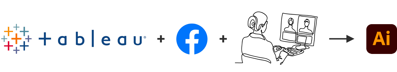
Tableau, Facebook Insights, Canva, Illustrator
Marketing team, CRM team
1. Defining
the problem
2. Research
3. Research
analysis
4. Designing
5. Testing
& refining
fortunica is a platform connecting spiritual advisors and advise seekers. Users ask questions on topics related to love, life, relationships, and career, which are then replied by psychics, who use various methods and rituals to find the answer. User can ask a question on a public timeline or in a private converstation, or choose a premium ritual for more in-depth advice.
The goal of the project was to increase visual consistency of in-app CRM campaigns with the overall design of the app. The challenge was to create variants for diverse markets (DE, EN, ES, PT) while respecting the differences in preferences for each public.
Problem statement
The in-app campaigns in fortunica app are not coherent with the UI. They lack consistency in colour schemes, fonts and graphics, which can create a confusion and discourage users to purchase. We need designs that reflect fortunica branding but also correspond with users' aesthetics.
Firstly I analysed the previously used designs along with their performance reports. I identified broken design rules to be improved. I also defined similarities between the best performing campaigns to have a better idea, what design elements might have been successful and should be kept. Based on my analysis, I formulated a problem statement:

I then searched through documentation collected previously for similar projects.
I discussed the project with the CRM team to find out what kind of templates they use and in what context.
Next, I talked to Market Managers of each market to clarify the needs and preferences of users and differences between each market.
To collect more quantitative and qualitative data, I used Tableau and Facebook Insights.
It helped me understand:
I then summarised and categorised collected data in an Illustrator file. I created Moodboards based on user’s favourite brands and pages followed on social media to have a clearer view of characteristics of visual preferences for each market. Based on the data from Tableau and provided by the Market Managers, I updated our Personas.
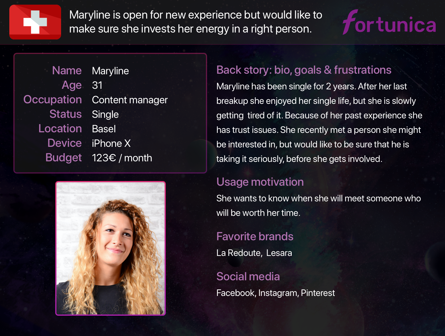
Example of a persona for DACH market (data altered)

Example of a moodboard for BR market
Having the Moodboards and Personas in my view, I started designing the templates. To make sure they will be easily readjustable, I used the software used every day by our CRM and Marketing teams, Canva. With my own designs created in Illustrator, and assets available in Adobe Stock and Canva, I created four different sets of templates, which I then refined based on the feedback provided by the CRM team.
Once the designs ready, I documented my whole research and design process in Confluence.
My designs were tested together with the older ones. If the old ones performed higher than the new versions, we compared the differences between the two and readjusted the templates.
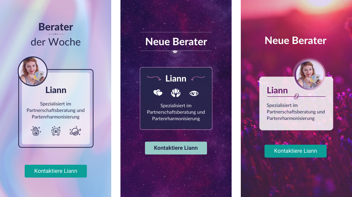
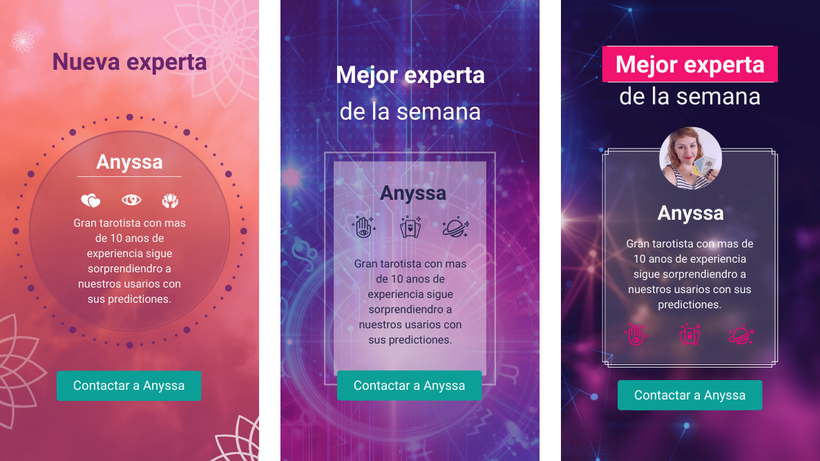
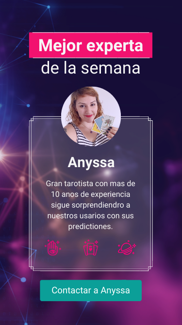
For example, we noticed that Spanish speaking users may prefer, when the photo of the advisor is bigger:

The steps collecting feedback - redesigning are looped. We regularly apply small adjustments or create brand new templates according to the test results.
I am currently looking for new challenges in Berlin or remotely.
If you'd like to collaborate, send me a message and I will reply within 2 business days.
You can also drop me a message on LinkedIn or call me at +49 (0) 176 72580153.