
User Research, Research analysis, Information Architecture
Darja, PO - brainstorming, supervising and defining constraints
The Dev team - feedback on technicalities
Pen and paper, Figma, Figjam, Google Sheets
1. Defining
the problem
2. Research
3. Information Architecture
Denizen connects people who need a temporary office space with those who don’t use theirs. It’s a web and mobile app where individuals and companies can book any type of working space. Denizen offers their own coworking spaces, as well as third-party-owned offices and venues.
The goal of this project was to improve the categorisation of our offer to present users with a clearer overview and improve their understanding of our services.
This is part of a global IA redesign project. In this case study, I will focus only on the booking flow, being part of the Spaces/Explore tab.
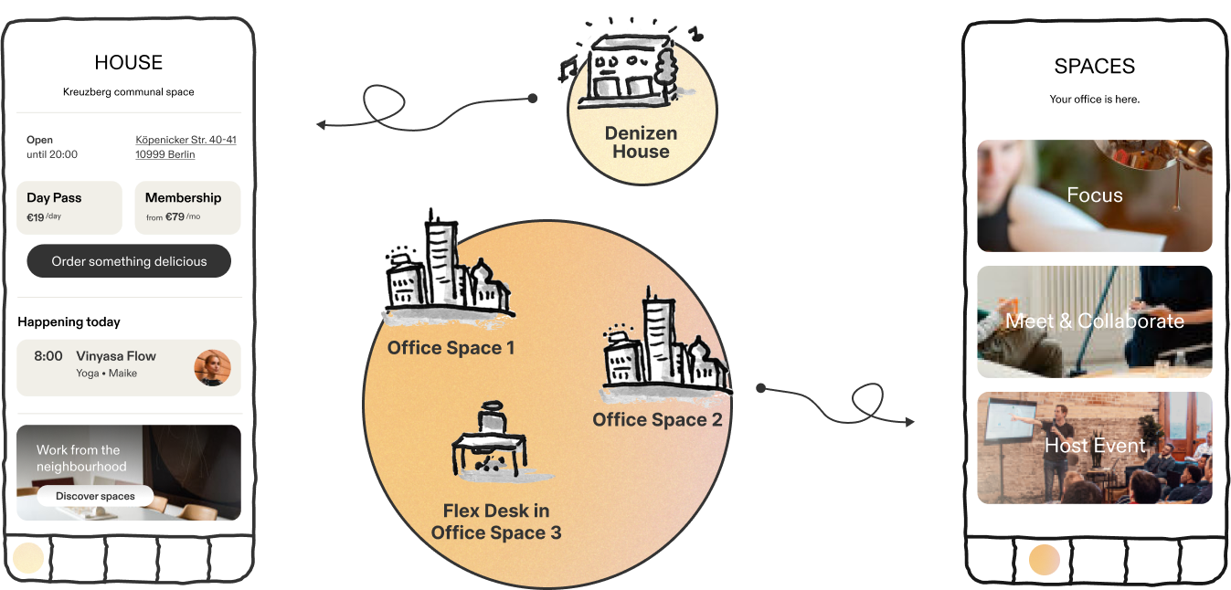
Originally, the core product of Denizen was the Denizen House, a Denizen-owned coworking space. The secondary product was an Airbnb-like booking engine for third-party office spaces. Because of this duality, the app contained one tab for the office spaces (Spaces tab) and a separate one dedicated to the Denizen House (House tab).
The initial distribution of information about our spaces (created by the previous designer)
With time, the range of our offer grew and new coworking spaces joined but the UI didn’t evolve accordingly. As a result, Denizen House, which was now just one of a few Denizen coworking spaces, still had its special tab, whereas all the available spaces, including *also* the original Denizen House, were presented in Spaces tab. Both tabs had a booking functionality, but different booking flows.

The initial distribution of information about our spaces (created by the previous designer)
This resulted in serious problems:
#1 Outdated UI reflecting the business duality irrelevant to the users
Users did not understand the differences between the various types of spaces and ended up accidentally booking spaces they did not intend to.
#2 Increased customer care workload
This generated extra incoming requests for refunds and assistance from the Community Managers, who needed to work overtime and could not focus on other areas of community care, decreasing customer experience and loyalty and the brand image.
Because of this repeated customer feedback we decided to improve the way we advertise our offer via our app.
Additionally to the incoming customer service requests, we had plenty of user feedback, collected during various tests and interviews in course of previous, not directly related projects.To define the most severe pain points, I reviewed the records and created a Google Sheets document with relevant remarks. Then I rated the severity on a scale of 1 - 5, in a similar way I would rate usability errors.
What I noticed:
The most recurring and severe feedbacks were:

I don’t understand the difference between Denizen House in the House tab and the one in the Spaces tab.

I don’t understand how Denizen House is different from all the other spaces.

I don’t know what the categories “Focus”, “Meet and collaborate” and “Host Event” (in Spaces tab) mean.
Opportunities:
To empathise more with our users, I picked two of our personas who were likely to go through the booking flows and prepared a figjam file ready to brainstorm the journeys.
I invited our PO, community managers and sales team to a Customer journey workshop, where we collectively filled out the templates.
I then highlighted the parts of the journey that were touch points with our app with its current design.
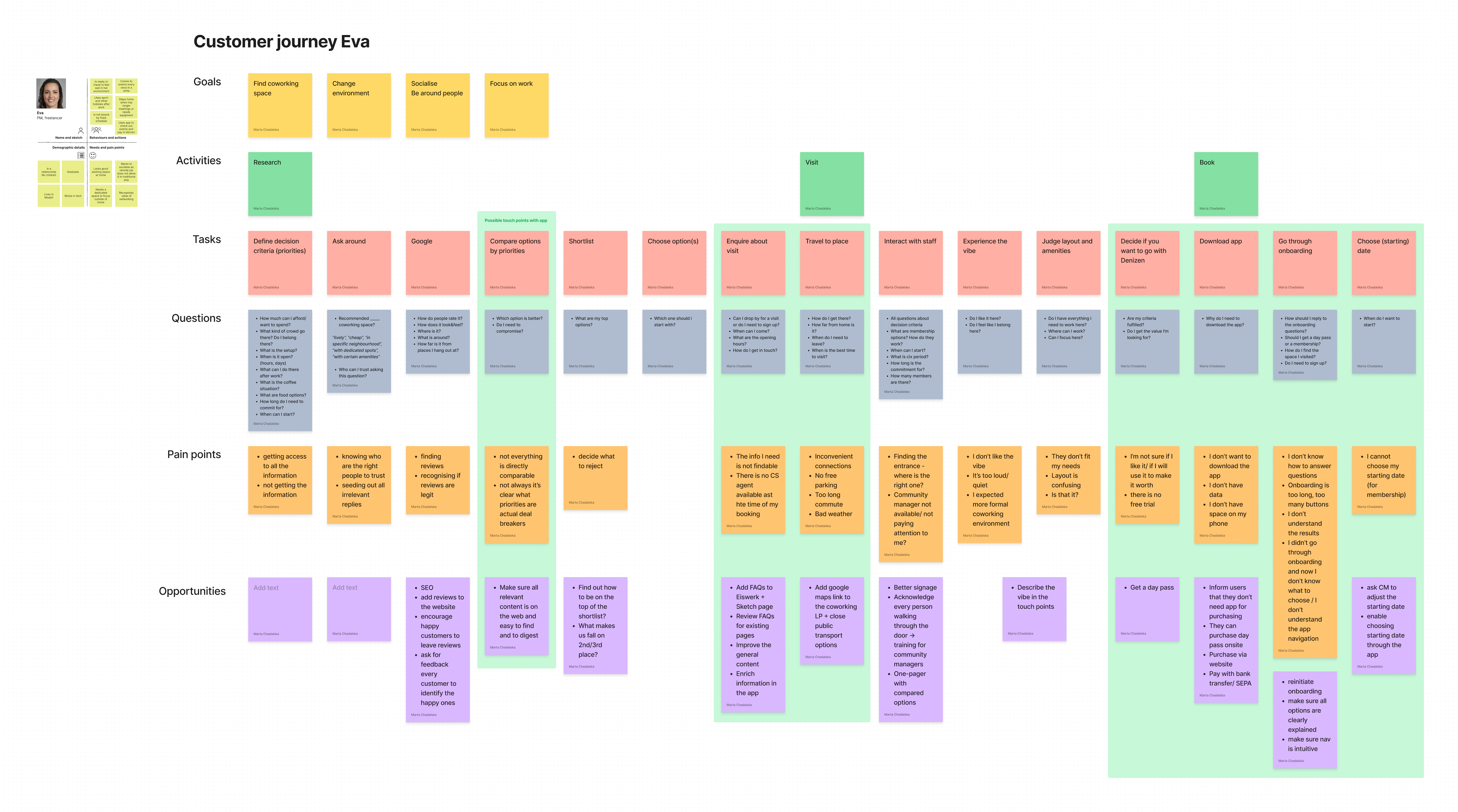
Extract of the customer journey created for the persona of Eva, the coworking space guest (click here to zoom in)
What I noticed:
Opportunity:
We should provide more information about each space in a condensed way to enable users easy comparing.
In parallel, I conducted a content audit of every feature of the app on all screens and recorded it in Google Sheets.
I then wrote down every feature on a separate Post-it note and run 3 rounds of affinity mapping.

What I noticed:
The contents related to House and Spaces tabs often ended up in the same categories.
Opportunity:
We could merge the content of both tabs and use one of the remaining tabs for a different purpose.
To confront our current system of categorising the spaces with the way our users understood it, I run an analysis:

What I noticed:
The two systems were different from one another.
Opportunity:
The app should reflect the system created by the Sales team as it corresponded to how users spoke about our spaces.
The above research helped us clarify the main problem: the way we categorised and described the spaces did not match the way users made their decisions.
Originally, the different categories of spaces in the Spaces tab were hidden under categories which replied to a question: What would you like to do?:
Users did not understand those categories, so we decided to redefine them. We defined 4 new categories, which emerged through the HubSpot analysis:
The new categories referred to functionalities of spaces and were more specific than the original ones. They also answered a different question: What are you looking for?.

In order to end the distinction between Denizen House and the rest of spaces, we decided to completely reshuffle the content of the House and Spaces tabs:

Based on the customer journeys and user interviews conducted as a part of a different project, we knew that our guests had many more criteria to consider when looking for the right space.

We wanted to present the most important characteristics of each space at a glance on the search results page. For this reason, I created a system of keywords intended to be used as tags summarising the main characteristics of spaces, which our sales team then attributed to each space.

Extract from a Google Sheet to attribute tags
I then prepared a site map summarising the new distribution of content.

Extract of the site map - Explore tab only (click here to zoom in)
I prepared a user flow describing how to navigate between the new screens. I kept as much of the original flow intact as possible to reduce the learning curve for our active users.

New booking flow (Click here to zoom in)
The gathered insights and ideas served as a base for the next stages of the general redesign project, starting with drafting lo-fi wireframes to designs ready for developer hand-off. The designs should go through at least one round of user tests and refinements before entering the development phase.
The new designs are not fully live yet so we don’t know how they will influence the UX and business. To determine it, we should observe the average monthly percentage of incoming customer requests to change or cancel bookings in the volume of all requests. If the percentage decreased compared to the pre-redesign period, we could conclude that the redesign was successful.

I am currently looking for new challenges in Berlin or remotely.
If you'd like to collaborate, send me a message and I will reply within 2 business days.
You can also drop me a message on LinkedIn or call me at +49 (0) 176 72580153.