User research - UX Design - UI Design - 2021
INCLOUD 24H design challenge
Overview
My role
User research, Research analysis, UX Design, UI Design
Tools
Facebook and Instagram as communication channels, Pen and paper, Figma
My approach
2. Research
- Desk research of the industry-specific terms
- Mini user-interviews
- Benchmark research.
3. Designing
- Summarising my dashboard design knowledge
- Fast prototyping
- High-fidelity mockups
- Component library.
Incloud was a digital agency specialising in B2B products using IoT solutions, where I worked on various projects as a UX/UI designer. Because most of the client data was confidential, it would be challenging to share my real projects. However, as a part of the hiring process, I was asked to take a 24-hour design challenge, where the “project” was very similar to what I would do in real life. This case study does not contain any real data but it represents the approach I applied to my actual work.
Research
Desk research of the industry-specific terms
This analysis helped me formulate questions I needed to find answers to be 100% confident that I understood the problem correctly. I determined that I should find out the following:
- How does NFC work? How is it reflected in UI?
- Are there any best practices for Dashboard design specific to factories/industrial environments?
- What are the characteristics of the environment for factory workers and how would they influence their interaction with the hardware and software?
I googled key phrases extracted from the questions above to find sources for my desk research. I consulted a.o. Dev documentation for Android development to understand the technical side of NFC. I also watched some YouTube videos “shadowing” factory workers to get a better glimpse of the everyday environment of the target users.
Mini user-interviews
I also reached out to my private network via Facebook and Instagram to check, if any of my connections had experience with the topic as a Fachbereiter (skilled worker taking the measurements with the mobile app) and a Manager (the administrator overlooking the desktop Dashboard). I found two friends, who used to work in each position.
Tomasz, mechatronics engineer explained to me the usual interaction a worker has with a machine producing tools. That helped me understand the overall context in which such an app would be used:

Those types of machines are highly automated and the worker is there mostly to intervene when something goes wrong in the production process.

The workers can recognise when measurements are off. They should report any anomalies to their supervisors so further diagnostics and maintenance can be arranged.

The admins oversee the general performance of the machines. They can spot if certain machines require more maintenance than the others or if they can handle heavier workload.
Patryk, line worker shared his experience:
We collect similar data but we do it manually. It would make our job much faster if we had an app for it.
We use thick gloves so it would be hard to use a smartphone because it’s hard to aim at small buttons.
Thanks to both interviews, I was able to put the dry technicalities included in the brief into a more vivid context. Now I could understand, why such data needs to be collected.
Gathering UI inspiration and small benchmark research
Having a much clearer understanding of the product and its context, I had an initial idea of how the data could be distributed across the screens. To gather more inspiration, I collected screens of apps that use NFC and some dashboard designs. I also found some examples of software used for monitoring tools in industrial environments to have a better idea of possible best practices in the industry.

What I noticed:
- The NFC part of the app tends to have a simple design before activating the NFC. The outcome of the process is communicated in real-time on the phone screen.
- Industrial dashboards use colour-coding to signalise the severity of the measure states and entice the user to take action if necessary.
Designing
Summarising my dashboard design knowledge
To kick off the design phase, I wrote down the best practices to follow while designing the dashboard, based on my previous professional experience as well as the analysis of the designs in the research for this project, such as:
- Always show only the necessary data and in the right context. Let the user unfold details, if they wish so.
- Don't overuse status colours such as green, yellow or red to mark data. Use them only to highlight data that suggests need for action.
- Use easily recognisable icons for better scannability.
User flows and fast prototyping
I referred back to the user stories and the interviews and collected all the necessary features. I grouped them based on functionality and imagined their possible distribution across screens and flows between them. For this brainstorming part I used pen and paper.

Extract of results of fast prototyping: app screens
High-fidelity mockups
Having first skeletons of screens I started transferring the ideas into figma. I started defining colours, fonts and other branding elements.
Primary colour:
I chose blue for primary colour as a safe bet. I didn’t have any information about the identity of the company so I chose a colour that is universally associated with technology, but also safety and reliability.
Dark mode:
I decided to go with dark mode because the app would mainly be used in terrain so I had to focus on accessibility and battery life. Dark mode reduces eye strain in low-light conditions and conserves battery power. It also reduces glare, which is more eye-friendly, especially for possible night-shift workers.
While choosing the shades of gray, I respected the basic UI recommendations such as avoiding using the absolute black #000000 and white #FFFFFF. I also followed the guidelines of Material Design and Human Interface.
Accessibility check:
I verified contrast of each used colour combination with the WCAG 2.0 contrast checker. It assured me that all the data would be readable in any conditions.
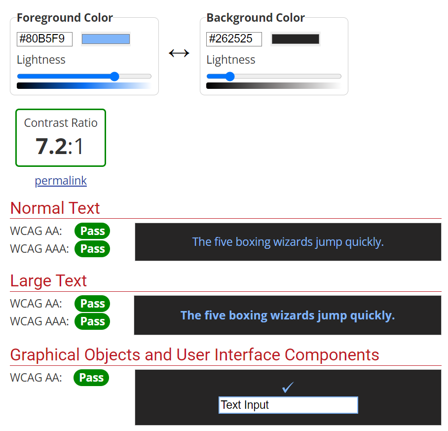
Example of results of contrast check for a shade of the primary colour against a card background
Size of touch targets:
Because the app would be used in thick gloves, all the buttons and other interactive elements would need to be large enough to prevent missclicking. I researched min. size of tap targets for users with motor impairment and applied it to the components.
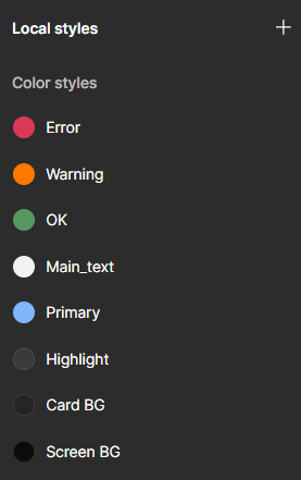
Component library:
Already as I was designing the first screens, I made each element a component, assigned each text field to a text style and each colour to a colour style. That way, it was extra fast to experiment on the visual side of the UI and test different visions. I placed every main component on a separate page dedicated to components for a better overview. While naming each element, I followed a name structure which would allow me to easily find it:
(Name of the platform) / (Component type) / (Content or functionality) / (If relevant: state)
Extract of the component library
Once the designs were ready, I arranged the Components page to make a clear division between App and Desktop content and segregate it through topical sections.
Final designs
App:
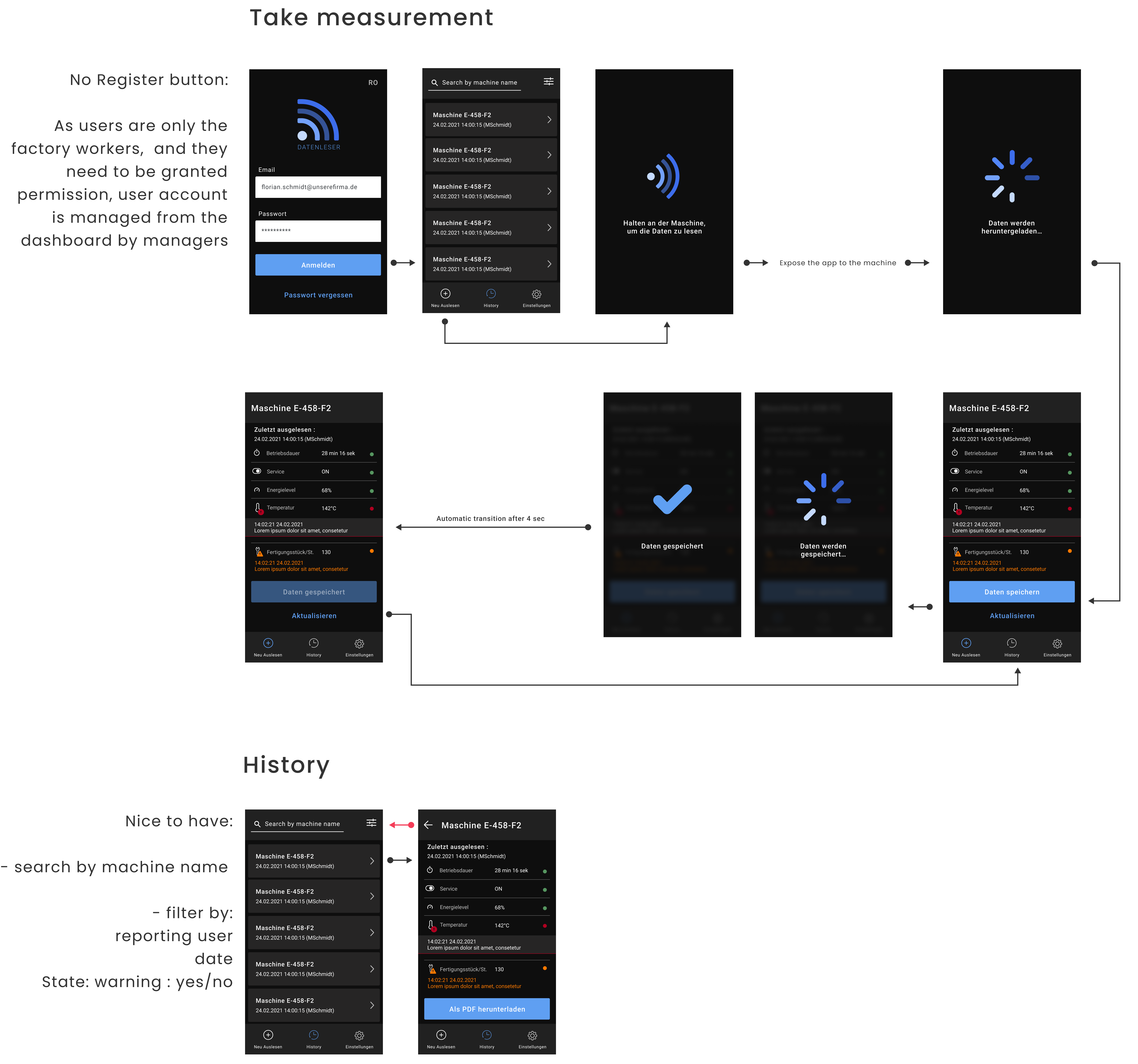
App designs (Click here to zoom in)
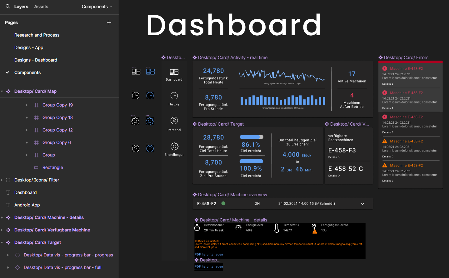
Dashboard:

Dashboard designs (Click here to zoom in)
Next steps
Refining the designs
If I had more time, I would work more on the details of the final designs, e.g.:
- test the designs, esp. sizes of touch targets and spaces between them, and refine them based on the test outcomes
- reevaluate the colours I used (e.g. do they represent the level of urgency well?)
- align elements to a grid.
What I learned
- How to process information about highly technical and industry-specific information about requirements and constraints outside of my usual area of expertise
- How to work under significant time pressure
- Basic knowledge about NFC and tool manufacturers.