
Research & research analysis, usability testing, UX & UI design
Sketch, InVision
1. Defining
the problem

2. Research

3. Testing & research
analysis

4. Designing

5. Testing
& refining

As a former customer service employee, I was provided with first-hand user feedback on our service every day. I noticed that our customers required more assistance with certain actions than with others. This is why I decided to redesign one of the most important flows of the platform: the reservation process.
I chose as my main goals:
1. To reorganise the placement of information crucial to offers in order to facilitate customers taking conscious decisions on their purchases by making details of each offer better visible
2. To reduce the cognitive load of our users by simplifying the overall UI of the platform.
I believed that such a makeover would bering the following business benefits:
- Better customer satisfaction resulting in better customer retention
- Reduction of customer service workload resulting in more customer service workforce focusing on more complex tasks.
Thanks to my experience at the customer service department, I already had an initial idea of the problem to solve.
Problem statement:
Users need easy access to information about accommodation deals so they can choose the most suitable offer by consciously agreeing to booking conditions.
To define more precisely possible pain points of an average booker, I formulated several job stories. Example:
When I get to choose accommodation for my trip, I want to be aware of all the booking conditions, so I don’t end up committing to something I do not want.
To verify my hypotheses, I first analysed the current state of booking.com desktop and mobile website by conducting its heuristic analysis. I also consulted online reviews of booking.com customers and talked to the customer service employees. The main takeaways were that:
I then analysed UX and UI of some of booking.com's main competitors: AirBnb, Expedia and Hostelworld. Their main advantages were:
Extract from the heuristic analysis
Visibility of system: good
User is informed about the ongoing process, there is a progress bar in the booking flow, animations during loading, etc.
Match between system and real world: not good
The tone of voice is causal and many labels are too vague or abstract for users to clearly know what values they communicate.
User control and freedom: mediocre
From the technical POV user is provided with tools to accomplish tasks, however cognitive overload caused by too much written information, inconsistent visual design and invasive language urging to take certain actions immediately takes the sense of control away.
Consistency and standards: mediocre
Designs of buttons and other interactive components is similar across pages, however the wording for same features (e.g. sort) varies between desktop website, mobile website and mobile app.
Error prevention: extremely poor
Because of its placement, none of tested users were aware of most crucial information possibly influencing their final decisions. They were not aware of the fine print or the fact that general photos of the property did not equal photos of specific room type.
Recognition rather than recall: technically good but causing much of cognitive overload
Users are flooded with pop-ups urging them to finish their bookings, the main page is cluttered with suggestions based on their previous searches that often lose their relevance once users have completed their trip.
Knowing better the most recurrent user problems, I wanted to discover their source. For this reason, I conducted a series of remote user interviews combined with moderated usability tests of the current booking.com website.
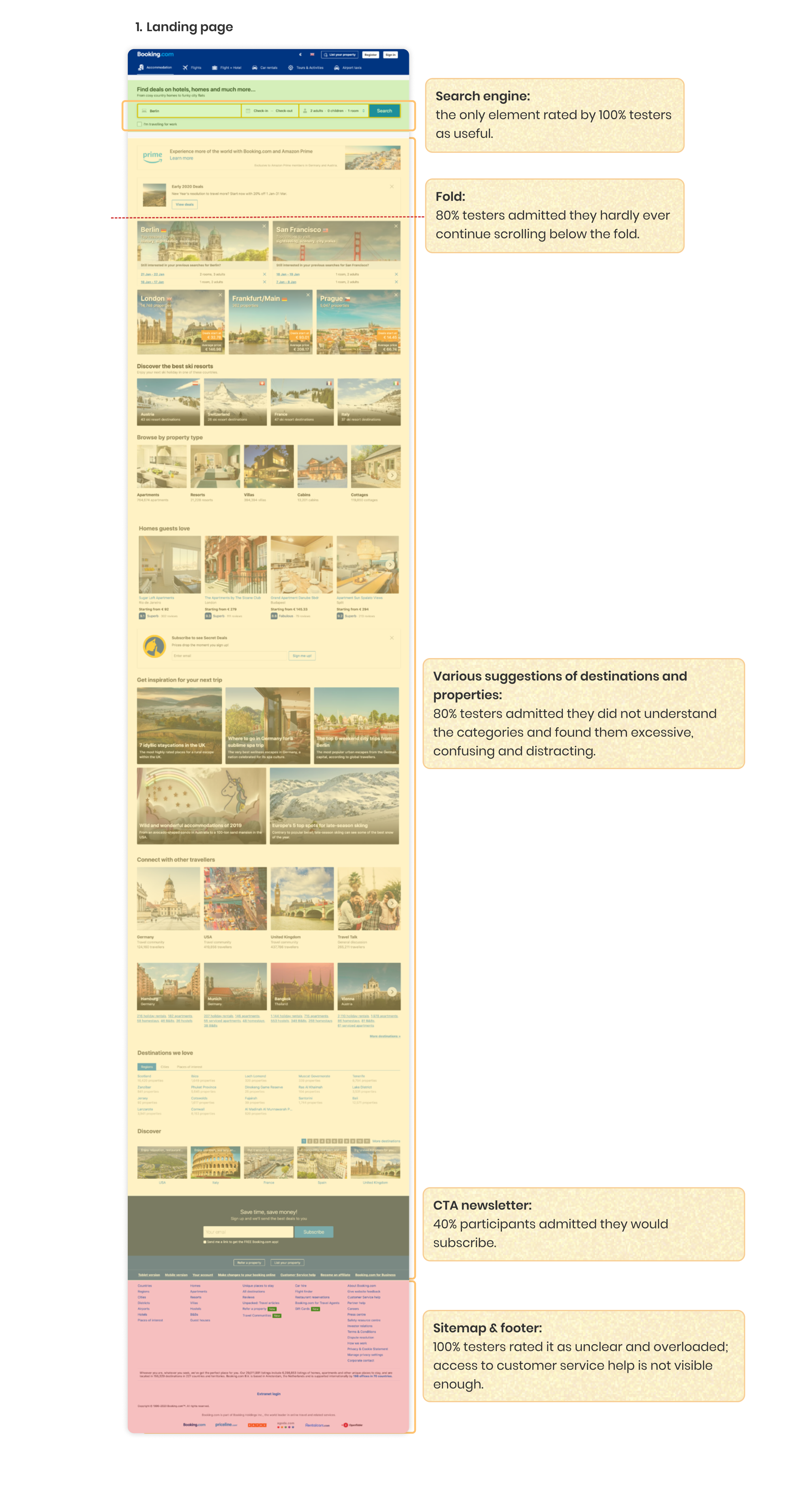
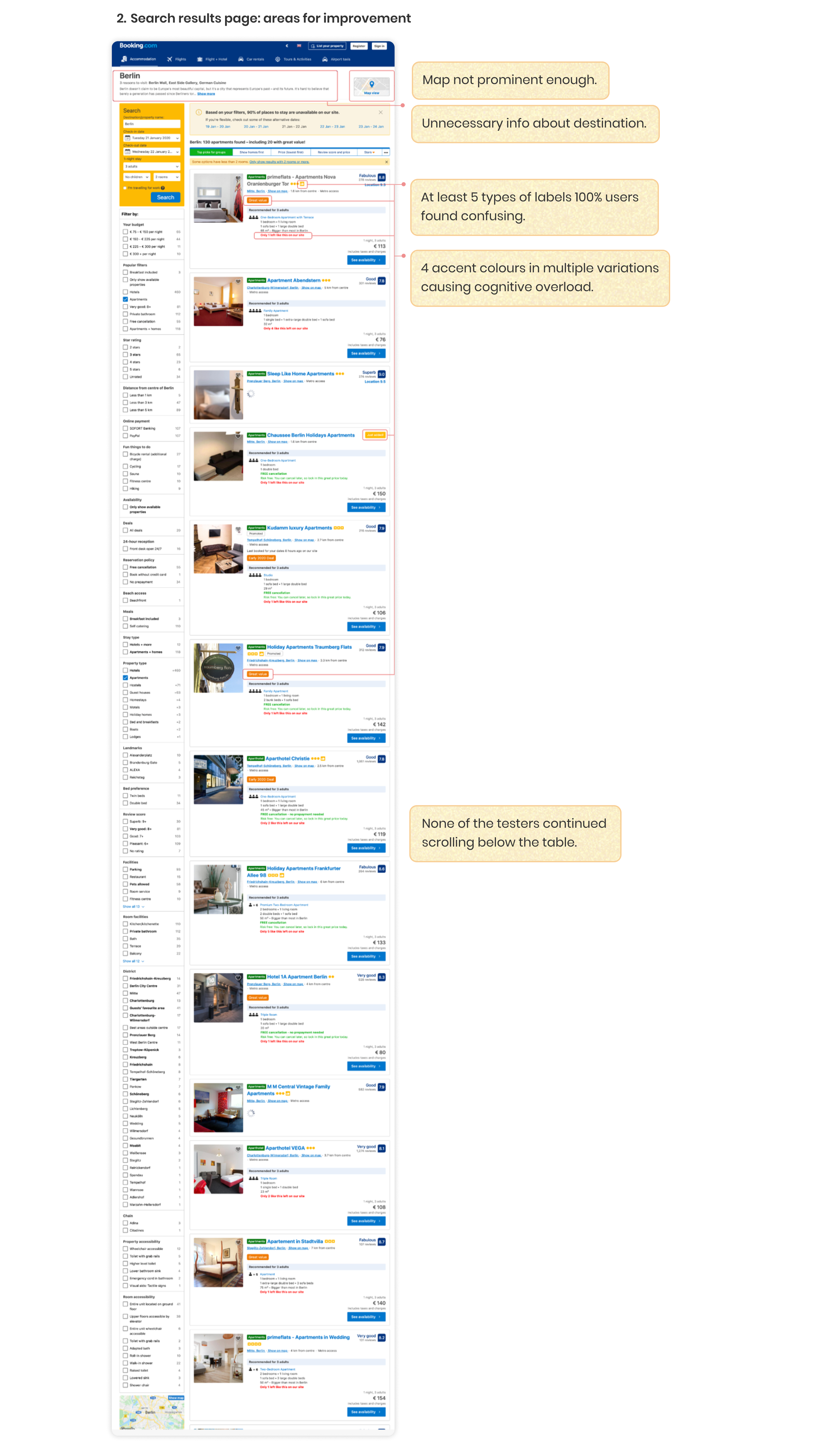
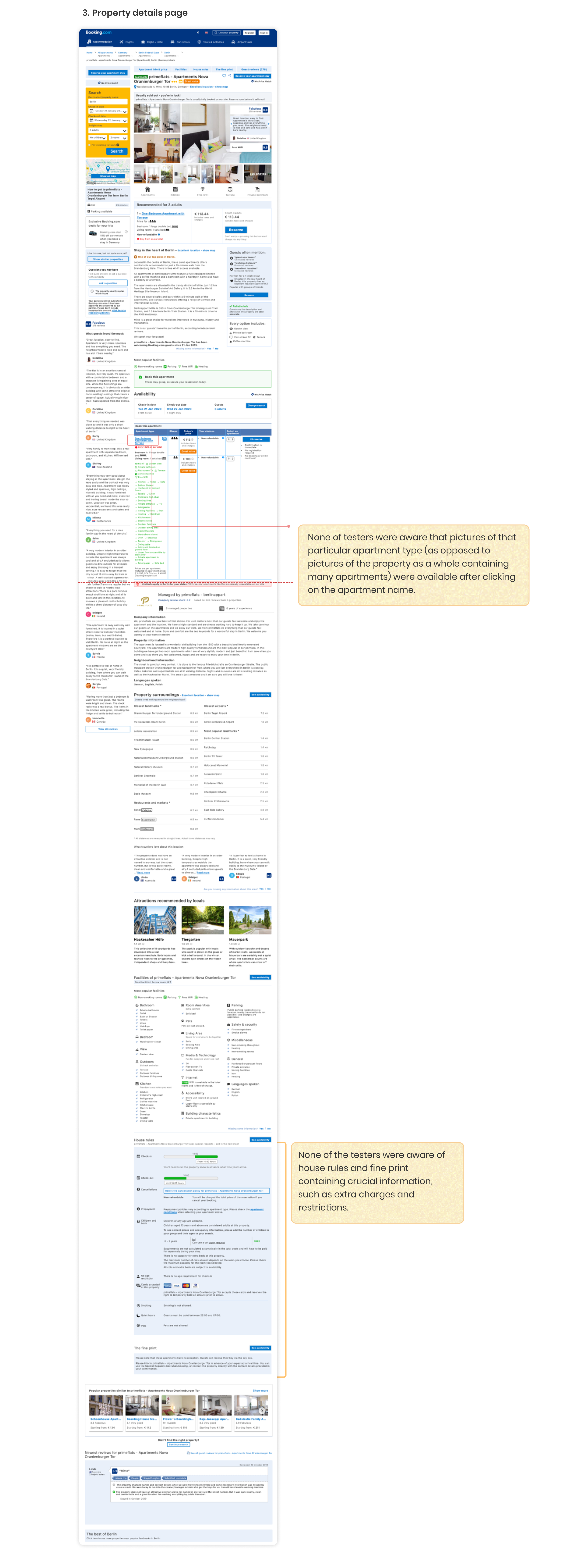
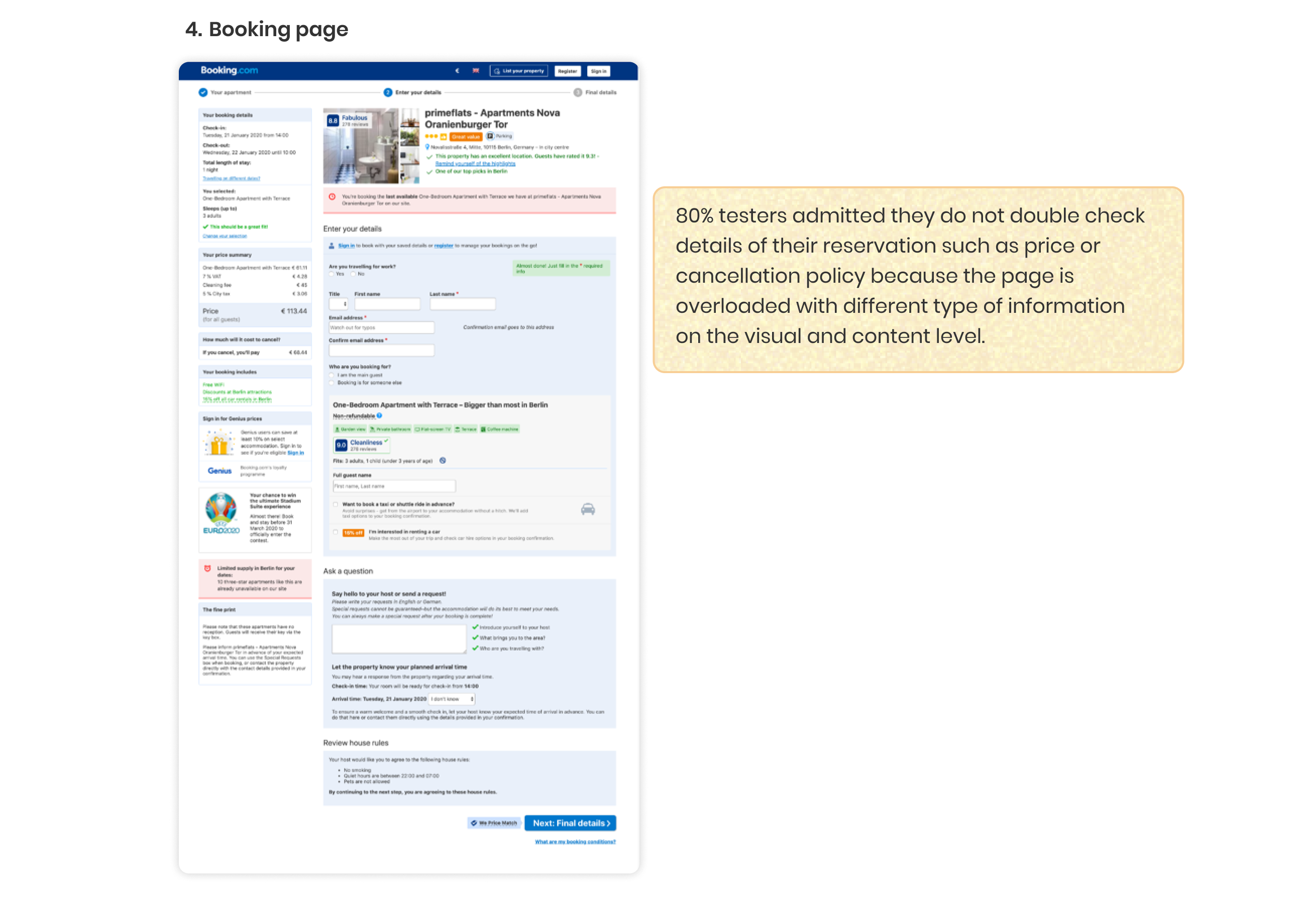
Same issues could be observed for the mobile version of the website.
Based on my findings, I designed a reservation process user flow, which let me choose which layout elements eliminate, emphasise or move in order to facilitate bookers decision making and eliminate all possible frictions.

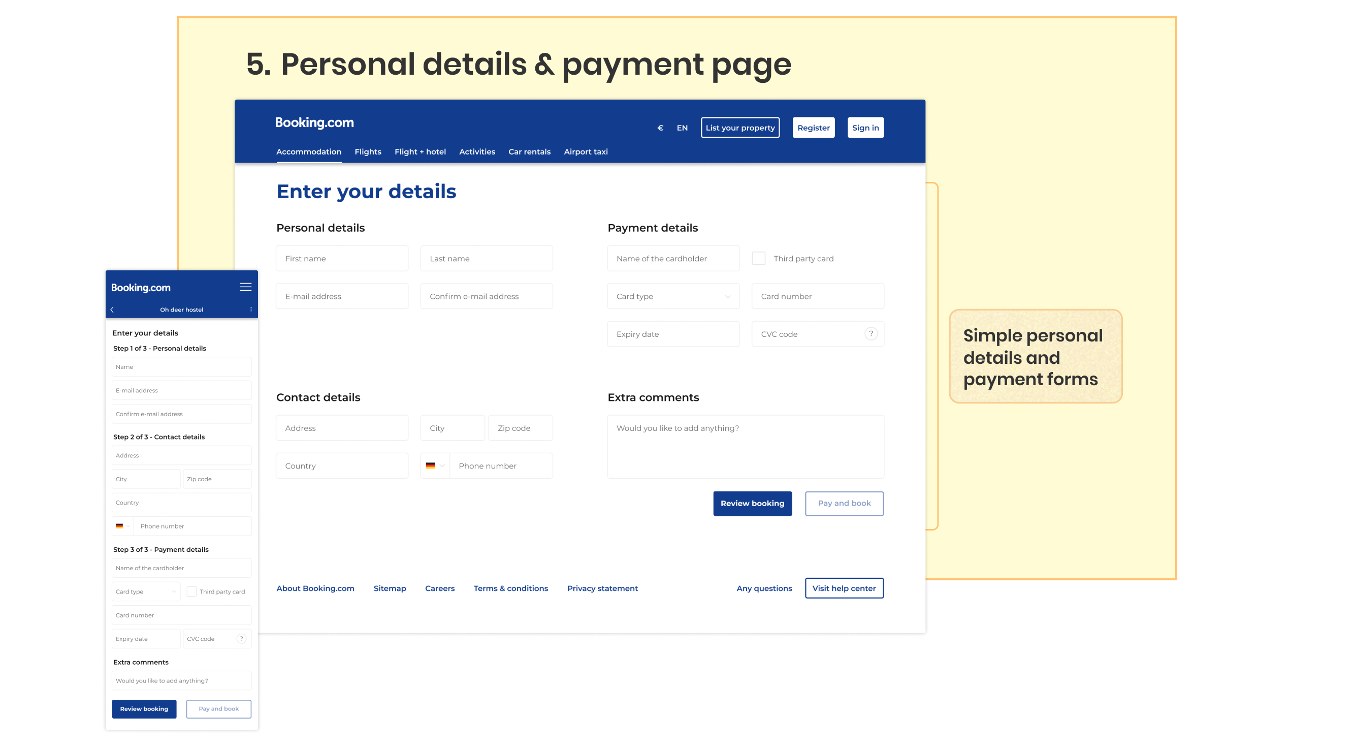
Having deepened my understanding of user habits, goals and needs, I could craft my first mid-fidelity wireframes. The ideal layout would place the Important information (fine print) and House rules above the Room type table as the user would have no choice but to scroll through those section before choosing their deal. However, this exposition would not entirely respect the business needs. I decided to place this information below the table and repeat it at the top of the booking summary section (next page), to make sure the customer would see them at least once. To reduce cognitive load, I moved the personal details and payment forms to the third and last step of the booking.

In the mobile version, I separated the Room type table from the Property details page for extra clarity.

I then refined the UI of the wireframes and connected them to create a high-fidelity prototype, to test it on a small sample of users.
I conducted 6 in-person moderated usability tests, which included a SUPR-Q questionnaire to measure user satisfaction. The results of the tests, measured with Jakob Nielsen’s error scale, revealed only cosmetic errors. The website scored 60 SUPR-Q points out of 65. Based on the collected feedback I refined the final version of the prototype.


The next steps to follow after the design implementation by the development team would be measuring the impact of the new flow on the customer satisfaction and conversion. We could monitore those numbers through:
I am currently looking for new challenges in Berlin or remotely.
If you'd like to collaborate, send me a message and I will reply within 2 business days.
You can also drop me a message on LinkedIn or call me at +49 (0) 176 72580153.